")
The Dashboard is the first page you will see when you log in to Jeffrey AI, represented as a table icon on the main task bar.
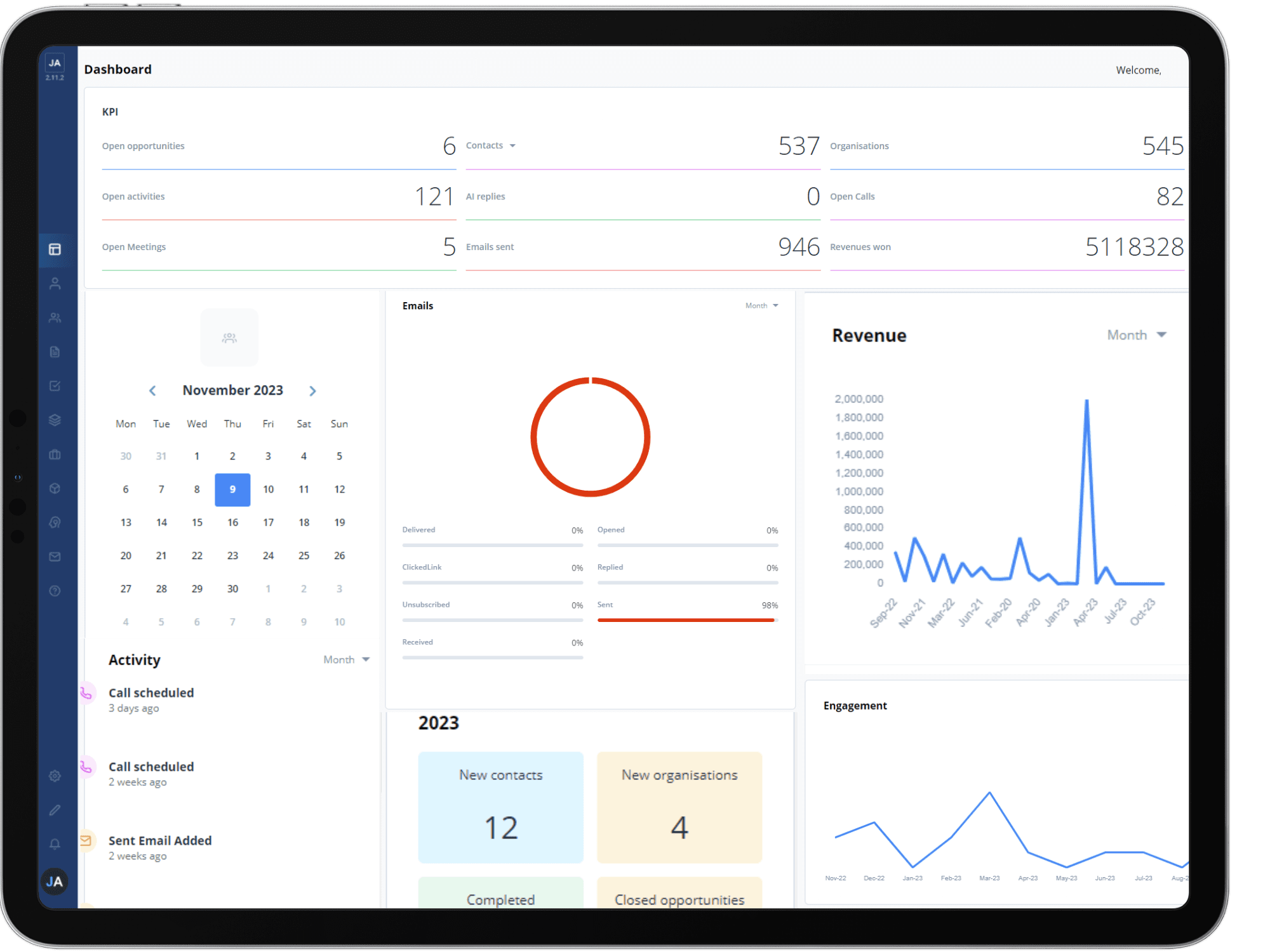
The Dashboard displays a variety of graphs, statistics and information about how you, your team, and Jeffrey AI are currently performing, as well as recent activity and upcoming tasks.

At the top of the page a number of statistics will display showing changes in deals, tasks and replies, with arrows indicating whether they have increased or decreased based on the time period.


The contacts, organisation and engagement line graphs show you how many are being created over time. You can change the date range of the graphs in the top right-hand corner to shorten or extend the time period. You can also check the values of data points by hovering your mouse over the point.

The messages pie chart will show you a breakdown of the proportions by which messages are sent, such as emails and AI responses.
Along the right-hand side of the page you will find a calendar and a list of the most recent activity, so you can see what you have planned for the day and pick up from where you left off previously.